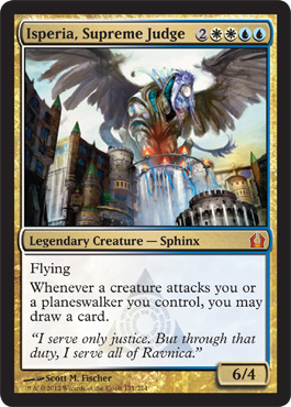
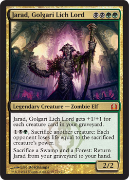
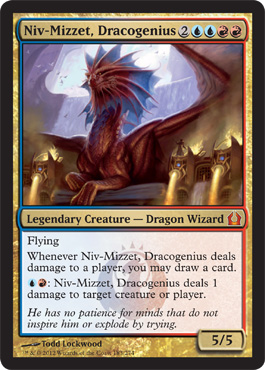
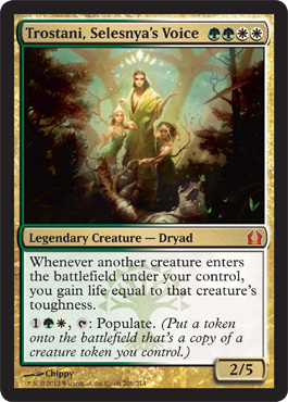
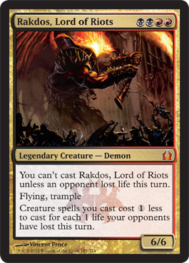
I can understand why people love these, I fell hard myself about a year ago.
I'm going to do my best to show you how to make these. It's intimidating, I know, but bear with me. I'm going to give you the best start I can, and the rest will be up to you. It'll take time and practice and some things gone wrong before you start getting your work to where you want it.
Before I get into the details, I have to give thanks to Zeerbe, HolyProxyBatman, Happy Gilmore, and all the rest of the denizens and contributors of the Digital Rendering Thread on MTGSalvation. This is where I learned, I posted cards that in retrospect, need to be redone, and where anyone can ask for specific advice.
I would strongly recommend that you read through that thread. There's a lot of different art styles, more than the 'super-art' I prefer, and maybe you'll be inspired in your own way. The thread is also the place to go if you have questions--the people there taught me what I know, and while I'm happy to answer questions as best I can, they have a lot more experience and skill than I do.
Also in the interests of full disclosure: This method will produce cards that are noticeably thicker and stiffer tha normal cards. These are not tournament legal, and to be honest, fall under the definition of counterfeit cards. Attempting to buy, sell, or trade these is a crime.
Once you get the hang of this, it's really not hard to do. I promise.
For the purposes of this post, I'm going with a reader request. Simon62 of the MTGSalvation boards contacted me a while ago and asked for help making a custom Doran, the Siege Tower. He just had a new addition to his family (yay and congrats!) so here's a present from me.
You know your card, but now to find the art. Maybe you have an image in mind. Maybe you've used your Photoshop skills to make an image. But if you need to find an image, I strongly suggest DeviantArt, CGHub, or Shadowness as places to start. It's true that Google Images can work, but you need to find high-resolution images, and Google isn't always good at that. My preference is DA, but I've used the others as well.
Pay attention to the color--nothing too dark or too bright! We can alter the image's properties some, but unless you're good at what you're doing (I'm really not) you can wash out the card and make it look not-as-good-as-it-should. Avoid watermarked images, and remember that a Magic card is a vertical rectangle, so that's all you will be able to see. No grand battlescapes!
In many ways, this is the hardest, most time-consuming part. You'll scroll through a lot of images that aren't what you want, trying lots of keywords, and
These are images that aren't quite good enough for me, and your impression may be different:
http://tsabo6.deviantart.com/art/Protector-tree-202775102?q=boost%3Apopular%20treefolk&qo=8
Not menacing enough for me.
http://tubularniko.deviantart.com/art/Forest-Protector-117572321?q=boost%3Apopular%20ent%20forest&qo=29
Too CGI-looking for my taste.
http://robjenx.deviantart.com/art/Life-Colossus-212833008?q=boost%3Apopular%20ent%20forest&qo=87
I love it, but it'll be tough to put into a card frame without ruining the scale.
For this piece, we're going to use "What Is It That Thou Desireth" by Elthenstorm.
I like this piece because it's menacing, fits a card rectangle well, and I think it'll look good with some spill.
To start with, fire up Zeerbe's Modern GIMP template in your program. (I've got his permission, don't sweat it.) The Super-Art is what we'll be using, and I also suggest you look through this file. This template allows you to create a digital replica of any style of card, from double-faced to level up to planeswalkers.
The active area is automatically 2.5 inches by 3.5 inches, which happens to be the size of a Magic card. But it never hurts to make sure!
You're also going to need these fonts installed, and they are all free from a number of websites:
Matrix Bold = Title, Card Type, Artist's Name
MPlantin = Text Box, Copyright Notice, Collection Number
Matrix Bold Smallcaps = P/T Box
MagicSymbols = Mana Symbols
As for the font sizes, I am a little inconsistent on that. I like to eyeball cards, adjusting the font size until they 'look right'. It's unscientific, I know. I also tend to make the ability text small, because I want to focus on the art.
What I do when I open a template is I go through and I make each layer invisible. This does two things: it tells me what is in each layer, or group of layers, and it gives me a blank slate to work with.
Save a copy of the template as your new card. In this case, it's Doran, the Siege Tower, so I'm saving it as Doran. SAVE FREQUENTLY.
Now that everything is blank, I add the image as a layer, and put it on the bottom. The rest of the image is going to be on top of this layer, even though we're eventually going to make it look otherwise.
Next, I have to stretch the image to fit the frame--this means some things won't be visible, and that's ok--I get to choose what the focus of the card is. I reserve the right to alter the placement or scale later on, and i likely will.
I like to get this step out of the way--now I add the artist's brush, artist's name, and the copyright text. Easy enough. I tend to add the name of the website, so in this case, it's "Elthenstorm of DeviantArt". The "Cliff is Awesome!" text is something I put on there for fun, and also as a custom watermark.
Zeerbe's template thoughtfully has the power and toughness box layers atop the text box layers. I've gone through and turned on the gold power and toughness box, as well as the title bar and the text box.
With that done, I'm going to add the name of the card as one layer, his creature type as another layer, the power and toughness in a third layer, and make visible the DCI expansion symbol. Zeerbe has put every symbol in there, along with the rarities, so I could put in something else if I wished. Because Doran's creature type is so long, I have to shrink the DCI symbol a little and center it. Again, all by eyeball until it looks right to me. It's worth mentioning that the text is never centered vertically, it's closer to the bottom than the top. This is something you might not have noticed until you started making these yourself!
Next, we're adding something that Wizards doesn't do--we're going to put a color gradient on the outline of the text box and the title box. They sometimes put a slight gradient within the box itself, but we're just hitting the outline. To make a custom gradient, go to the gradient, and select 'New Gradient'. You'll set up two segments: Black to Green, Green to White. Play with the endpoints and center points until it looks right to you. Then use the magic wand and select first the outline of the title, then hold Shift and select the outline of the text box. With those two regions selected, make sure you're working on the correct layer (always important), go back to the gradient tool and draw a line horizontally across your image. Should come out like this:
I'm now adding the ability text. As I said, I like to make these small, and I'm centering the text, so that I have some words at the same level as the power/toughness box. This is something real cards never do, but I do it so I can make the text box as small as possible, in order to show off the art.
Now the mana cost. This is going to be in three layers and the special font of Magic Symbols. First a text layer of ououo, making three black circles This is where I want to get the size right, and where I tend to look at a real card for comparison's sake. Now a layer over that of BWG, which is the mana symbols, in the same font size as the three circles we just made. Finally, copy the original ououo layer, and this will be our drop shadow on the mana costs--move this layer two pixels to the left and two pixels down. (With that layer selected, just hit the left arrow twice and the down arrow twice.)
Go back to the original layer, and you're going to bucket fill the three circles with the colors of mana. One of Zeerbe's layers is a color sampler, or just use these values:
W: fffcd5 = 255/252/213
U: aae0fa = 170/224/250
B: cbc2c0 = 203/194/192
R: f9aa8f = 249/170/143
G: 9bd3ae = 155/211/174
Aside from the spill and resizing the text box, we're done, and it's perfectly valid to leave it this size.
Before this next step is a good place to save a copy of this file. What we do next is make the art (the bottom layer) invisible and merge the visible layers. We do this so that we can resize the text box and create a spill of the art onto the title and text boxes. Make the art visible again.
Now, let's chop out a big section of the text box. Draw a rectangle selection that goes from under the top of the text box to right above the text we typed. (zooming in to 200%-400% helps get it precise, and you'd be amazed at how good your eye is at noticing when it's off!) Delete that selection.
Draw another rectangle around the rest of the type bar, and Cut it. Then move that drawn box down to the top of the text box, and Paste the selection into that layer. Move the pasted part until it's just right. GIMP allows you to anchor the selection, I'm not sure about Photoshop.
That's it for making a 'super-art' card. The last thing we are going to do is have the art 'spill' over the text box.
Before I spill, I copy the layer with all the text and such and hide it, in case I mess up. (I do, and did, especially at first)
In the art, I look for cool things I want to have be in front of the text box. In this case, it's the two top branches and the lantern, but the proportions are a little off. So I Scale my image a bit, until it fits a card frame better. Usually, I preserve the aspect ratio, but sometimes I need to adjust only one dimension or the other.
Now that I have the art where I want it, I have simply to cut away the part of the text box that are hiding things. I like the lasso tool for this--but I've seen this done with foreground selections or the magic wand tool. Those are a little harder to get the hang of (for me) and if you can master those, party on. The lasso does something obvious to me--it creates a polygon selection, changing direction each time I click. GIMP lets me adjust where I put those points, too.
Pro tip: Lower the opacity/transparency of the text layer, so you can see through the text to exactly what is underneath.
I've clicked a bunch of points, and when I connect the dots, it's a selection that I want to delete. Make sure you've got the right layer selected! (If you hit delete and it seems like nothing happens, you might have selected some other layer to delete from--happens all the time)
For this art, I'm just working on the title bar. I don't feel like I'm missing much, art-wise, and this is text worth preserving.
One more step, and then we're done with the digital images, I swear.
Create a new blank layer on top of the text layer, and call this 'Shadows'. Make a brush that's got a hardness of 30% or so, and a small-to-medium size. Around the edges of the spill, add a line or two of fuzzy shadow. It adds a lot of depth, but don't go too overboard. Make extra passes or make the shadows bigger as you desire--this step is all about preference. Don't worry too much about the direction of the light or things like that. Because of the lantern on this guy's branch, I did change the light directions around, but I'm a stickler and not many people will notice or care. I also tweaked the art's brightness and contrast a touch.
We are done with the digital part!
What do you do now? I could try to explain it, but it's easier to just show you the videos that showed me how to do it.
First, from HarderTimes about de-inking a foil. (I have had the best results with M10 and the Alara block, but your results may vary)
Next, a more detailed explanation of how to put it together, after you print onto a transparency.
And really, that's it. You're done. Enjoy!
The original place I heard about this was a Cube forum, and I've heard of people making an entire EDH deck from these. A lot of work, but potentially awesome. Even more work, but even more awesome, would be making your entire cube and lands from this process, several hundred to a thousand cards! Not impossible, but not easy.
I hope you got a lot from this--I like teaching people new things, so feel free to ask questions or comment.
See you next time!


